Blog Posts | December 6, 2018
Share ThisEditor’s Note: Over the past several years, IMLS has funded a significant number of digital library grant projects through the National Digital Platform (NDP) funding framework. Between 2014 and 2017, the agency invested more than 33 million dollars in 111 grants through National Leadership Grants for Libraries and the Laura Bush 21st Century Librarian program.
As of 2018, IMLS has revised the NDP funding framework. We took lessons learned and created the subsequent grant project category called National Digital Infrastructures and Initiatives (NDII), which allows continuity in our funding of digital library projects across the nation. In this essay, Diana Lisenbee, an extern with the Office of Library Services, shares an analysis of the formerly-named NDP initiative, now known as NDII.

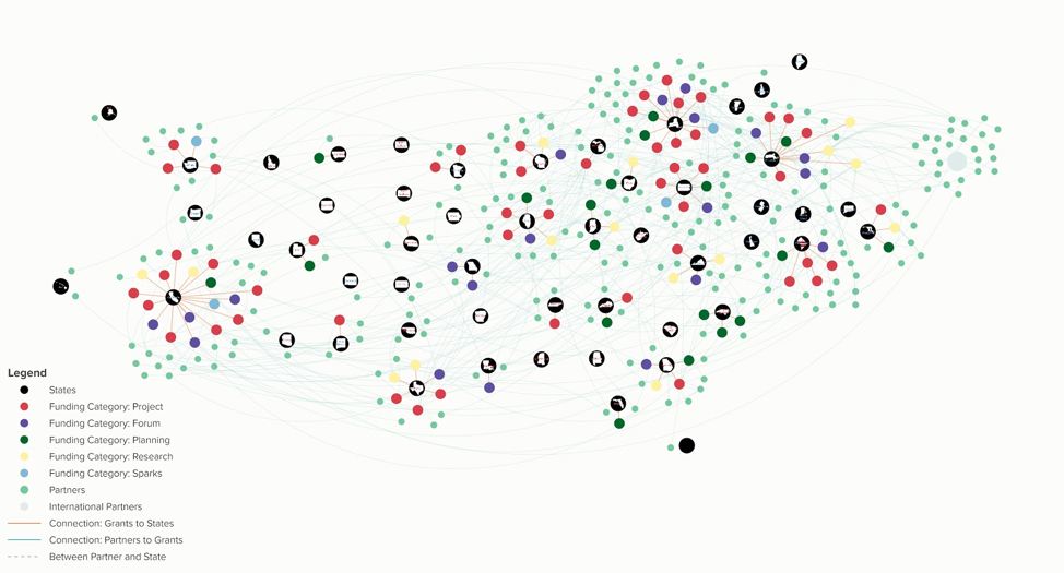
The heart of my internship was helping IMLS map the impact of the National Digital Platform (NDP) awards. Throughout the past year, I dug deep into the NDP grant data and used that information to create a social network map. The resulting visualization displays the partner institutions collaborating on each grant and shows the relationships between projects, partners, and geographic location.
The work funded by NDP ranges from expanding digital infrastructures, to bringing resources to the visually impaired, to increasing digital inclusion in urban and rural areas. But despite the diversity of projects, most are very connected. The visualization depicts the complexity of the enormous networks that cultural heritage institutions have built in support of shared tools and services.
Patterns emerged when I mapped all the NDP projects. I began to recognize the enormous partnership networks. For example, the University of Wisconsin’s Building A Framework For Help Feature Design Supporting Blind Users: Accessibility, Usability And Utility Guidelines For Digital Libraries grant (LG-70-16-0038-16) comprises more than a dozen partners in three states and the District of Columbia. By mousing over this project in the map, it becomes apparent just how far reaching it is. The visualization helps users understand the scope of the partnership and the time, effort, and planning that went into the project.
Read the full article and see Lisenbee's interactive visualization on Medium
